
 – Basic Level")
 Part 2")
 Part 1")


Having a dedicated website has become essential for almost all businesses today. And with the competition on the internet, it has become extremely difficult to stand out of the crowd. Developing a website that meets the needs of the business as well as the demands of the customers is a brainstorming endeavor that a business has to undertake. It is with the right set of ideas, attention to details and the art and science of the web designing that helps develop a responsive web design.
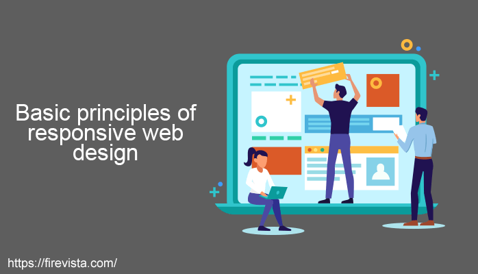
When you seek a Web Design Company in India you shall be bombarded with new and exciting ideas. It is here that you shall take attention to the principles of responsive web design that helps you conglomerate the ideas with the trends and develop a website that says it all. Here are 7 basic principles of responsive web design!
Harmony of design
Like everything else, the website also needs to have a balance in its design and presentation to make the right appeal. Practice harmony when it comes to picking the visuals, texts, fonts, themes, etc so that every aspect of the website balances out. Think of it as a graph chart where you weigh the visuals on the x-axis and features on the y-axis. As and when you keep adding new features the weight keeps on increasing. This shall hamper the website response, load speed, etc. Keep it as balanced as possible. There are two kinds of balance – symmetrical and asymmetrical. From left to right your website should have an asymmetric balance of images, texts and sections to make it feel organized – this is called symmetrical balance. And when you create a balance with unequal distribution of display elements – it is called asymmetrical balance. You can practice both or one on your website – depends on the choice!
Give some space!
Every website design should have some space for the reader’s eyes and minds to breathe. When the website is loaded with information and you put it up in closely packed design – the room for interest is lost. Giving space to different elements of the website helps emphasize where you want to draw the attention of your audience. It is here that you look for images that fit the desktop or mobile screens, complementing tag lines, selection of bolds and font sizes, etc, too. Space is defined by not just the dialogue boxes or the alignment but also the formatting of the posts, images, video spaces, etc.
Make the website responsive not adaptive
There is a big difference between a design being responsive and a design being adaptive. When a design is adaptive it mostly loads and responds based on the ideas that have been created for it to move into. Here the website is programmed to act like a certain way depending upon the other websites. But a responsive website is where you take into accounts the queries and taps of the visitors to make the website responsive. While both may look very similar, they are very different. And when the website is responsive it is a much better loading, answering and working website as compared to the other. Responsive web design gives a strong browsing experience.
Color Scheme
Color scheme of web design is a crucial aspect that Web Design Company in India works on. It is one of the principles that can make or break the website appeal. With the help of contrasting or complementing colors, you can create a background interesting for the audience. And it translates to everything from texts, videos, images, etc. It is in the colors you choose that you bend the mind of the readers and their moods. Blend between the warm and cold toned colors to strike the perfect chord. Lighter colors like pastels, whites, etc give a sense of neutrality to this blend making it easier to balance out the color scheme. Remember that dramatic colors bring dramatic effects and subtle tones keep it neutral. Your product, vision, and brand decide what colors you should go for.
The grid rule
All the web designers usually divide the website into the grids of 3×3 i.e. 9 equally or unequally distributed grids to define the layout of the website. For the display of images, texts, videos or any other advertisement too, certain grids are chosen to keep up with the pattern. Combination of grids for the videos, single grids for the pictures and sometimes all 9, for the texts! It depends on how much space and how much weight you want to give to the reader’s attention and experience. If you follow the grid rule well you are to bring together an easy to browse and strong website into play.
Don’t alter the texts
Responsive web design is mostly made for the mobile screens where you can display the details to the larger crowd of today. About 90% of the crowd today operates through their mobile systems. And here even the smallest of changes can bring a big impact. If you have a disproportionate size of the web txt, it shall balance out on the display of the characters on the mobile screen. The idea is to strongly build up the core response rather than keeping on making the changes. Altering texts shall make the screen size looks smaller. Keep it the basic that is served to you.
Use web fonts not system fonts
System fonts are restricted to be used only in certain PCs. Here there may be a difficulty in targeting a huge array of customers through your web design. To make it work for the millions of audiences globally, look for the web fonts that are universal over the internet. Instead of converting the system fonts to a generic one and spoiling the web experience, the web fonts shall display the true design universally.
Looking for a swift web design that meets the needs in this rapidly changing internet era? Follow the rules and get started with your own unique and responsive website that appeals masses browsing their experience on the mobile browsers.
You May Also Read –
-Beginners Guide on Back End Developers
-Learn to Become a Front End Developer
-Top 12 Programming Languages for Full Stack Web Developer
-Object-Oriented Programming – Beginners Guide
-SQL Developer- A Complete guide
-How Can You Benefit From a Machine Learning Course in India?
-Website Builders Choose the Free or Paid Website Package